Layout
The layout component is a compound component that provides a consistent look and feel for your application.
It allows you to divide your content into a sidebar and a main content area, with the sidebar typically used for items such as a table of contents or social links, and the main content area for the body of the article or post.
The layout component provides flexibility in the placement of the sidebar, allowing you to place it on either the left or right, or to have all of the content in a single centered column with the sidebar appearing just above the main content. This makes it easy to create a range of different layouts to suit your needs.
What makes this a compound component is the accompanying sub-components that come with it:
-
HtLayout.Aside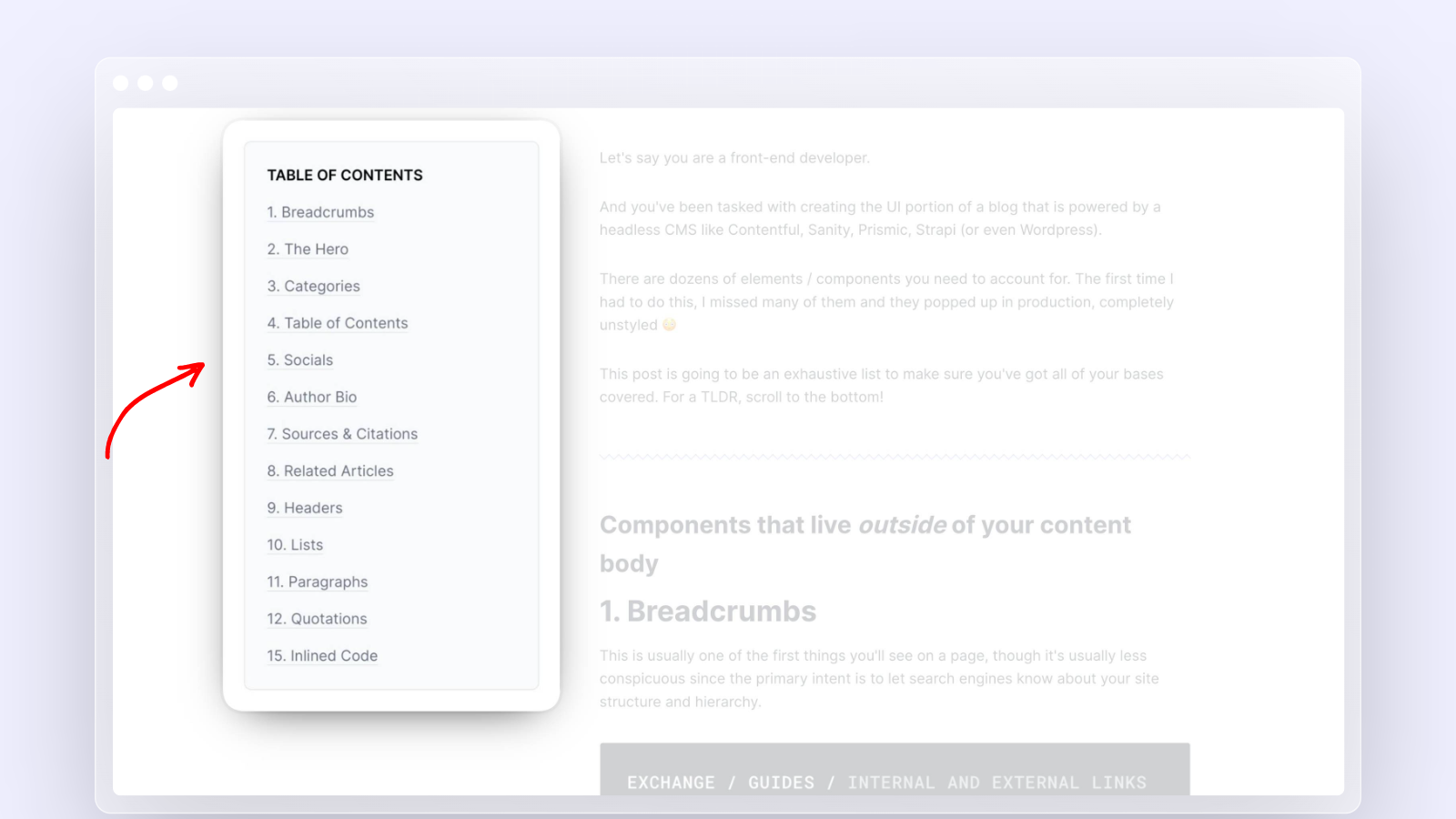
-
HtLayout.Main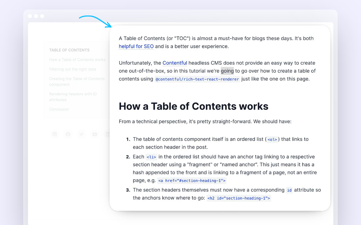
Here is how we use it in our blog. Note: we only need to import HtLayout since it's a compound component.
1
2import HtLayout from 'components/HtLayout'
3import HtHero from 'components/HtHero'
4import HtToc from 'components/HtToc'
5import HtPostBody from 'components/HtPostBody'
6import HtSocials from 'components/HtSocials'
7import HtAuthor from 'components/HtAuthor'
8
9...
10
11<HtHero
12  publishDate={post.publishDate}
13  title={post.title}
14  heroImage={post?.heroImage?.url}
15  heroImageAlt={post.heroImage?.alt}
16  authorName={post.author?.name}
17  authorAvatarUrl={post.author?.avatar}
18/>
19<HtLayout>
20  <HtLayout.Aside>
21    <HtToc items={[
22      { href: '/item-1', label: 'Item 1' },
23      { href: '/item-2', label: 'Item 2' }
24    ]} />
25    <HtSocials
26      twitter="https://twitter.com/headlessreact"
27      youtube="https://www.youtube.com/@headlesstemplates"
28    />
29  </HtLayout.Aside>
30  <HtLayout.Main>
31    <HtPostBody>
32      {documentToReactComponents(post.content, RICH_TEXT_OPTIONS)}
33    </HtPostBody>
34    <HtAuthor
35      name={post.author?.name}
36      avatarUrl={post.author?.avatar}
37      bio={post.author?.bio}
38      role={post.author?.role}
39    />
40  </HtLayout.Main>
41</HtLayout>
42
HtLayout.Aside Props
| Name | Type | Default | Description |
isSticky | Boolean | true | Whether or not you want the aside component to stick to the top of the screen when scrolling down. |
children | React component(s) | — |
HtLayout.Main Props
| Name | Type | Default | Description |
children | React component(s) | — |
Code